Font selection and typography style are essential considerations in website design. This might easily become a make-or-break situation. Fonts attract the user’s attention quickly and can either engage or repel them, so selecting the appropriate one is critical.
However, typefaces and typography do not have to be static. You may add interesting CSS text effects to your website to help it stand out. Scrolling text, shadows, text glow, style, color, 3D effect and many other features.
This post will focus on text loading animation and CSS text animations. These are basic and easy to incorporate into your design, utilizing pure HTML, CSS, and (in some cases) some JavaScript. They can be used on web pages that feature scrolling animations.
What is a Loading Animation?
Loading animations are indicators that let users know that the system is still processing their requests. When a user clicks on a link or button, the animation continues until the loading process is complete. Some animations include progress bars that show how long it will take for data or material to load.
This provides customers with real-time updates — or distractions — that make waiting more comfortable.
Examples of CSS Loading Animations
CSS allows you to design a wide variety of loading animations. Here are the five most frequent varieties, with several examples of each.
1. Infinite loading animation

Infinite loading animations instruct the user to wait without specifying how long. They can be employed when the wait time is unknown or extremely short.
2. Determine the loading animation
Determine loading animations, which show how long it will take for the website to load. These may provide a precise percentage or number but they are not required to. They can also be visual estimations, such as drawing a circle or filling a bar.
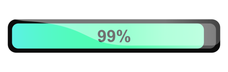
3. Progress Bar

Progress bars are a specific sort of predetermined loading animation. They are linear rather than circular, and they frequently display the user’s remaining time as a percentage, volume, or fraction.
4. Skeleton Screen Skeleton

This begins with a blank page and placeholder material. The pieces are gradually shown until the page is completely loaded.
5. CSS Loading Spinner

A CSS loading spinner is a circular animation that indicates the website is loading. The animation will continue on this circular track until the page loads.
Amazing Text Animations with CSS

These CSS text animations can help to make your website more engaging and give it a distinct look and feel.
However, keep in mind that not all of these CSS text effects will work well with every design. For example, with a minimalistic design, you could want to use a more subtle effect.
However, there should be a design here that meets the demands and expectations of each user to improve your design and appearance. Check out the text animation CSS codepens that we’ve chosen for you.
1. Scroll Based Text Animation
This is a wonderful example of how to apply CSS text motion while a user scrolls. This one employs a trigger for both scrolling up and down, ensuring that the animation works in any direction.
Scroll-triggered animations are ideal for single-page websites. If you’re not sure how to develop a one-page website, the fullPage.js library will help. You can even use it with WordPress builders such as Elementor and Gutenberg.
body {
  margin: 0;
  padding: 0;
  height: 200vh; /* Ensures there's enough scrollable content */
  display: flex;
  justify-content: center;
  align-items: center;
  flex-direction: column;
  background-color: #1e1e1e;
  font-family: Arial, sans-serif;
}

.scroll-text {
  opacity: 0;
  transform: translateY(50px);
  transition: opacity 0.6s ease-out, transform 0.6s ease-out;
  font-size: 2em;
  color: #ffffff;
  margin: 50px 0;
}

/* Animation when the text becomes visible */
.scroll-text.visible {
  opacity: 1;
  transform: translateY(0);
}
2. Text Color Animation Effect (CSS-only)
This one is just HTML and CSS, so it will be simple to use and does not require any JavaScript. It delivers a colorful transition of multiple colors across the text using a gradient, providing a very modern look.
You may easily adjust the chosen colors to match your brand by changing the hex codes in the CSS.
@keyframes colorChange {
  0% {
    color: #ff0000; /* Red */
  }
  25% {
    color: #00ff00; /* Green */
  }
  50% {
    color: #0000ff; /* Blue */
  }
  75% {
    color: #ff00ff; /* Magenta */
  }
  100% {
    color: #ff0000; /* Red */
  }
}

.animated-text {
  font-size: 2em;
  font-weight: bold;
  animation: colorChange 4s infinite;
}
3. Static CSS Color Change
This one is ideal for a large title because it changes the color of each word without a transition. This CSS text effect is excellent if you have a simple design and don’t want things to appear overly busy.
The animation’s colors and speed can be simply changed thanks to its HTML and CSS code. Simply tweak the codepen’s CSS to see what happens.
.static-text {
  color: #ff6347; /* Sets a static text color (Tomato) */
  font-size: 2em;
  font-weight: bold;
}
4. Morphing CSS Text Effect
A more advanced animation is created with only HTML, CSS and JavaScript. As seen in the text animation CSS codepen, adding a little JavaScript allows you to create more complicated animations.
However, this one is still reasonably simple to modify and tailor to your business or style.
.morphing-text {
  font-size: 2.5em;
  font-weight: bold;
  text-transform: uppercase;
  display: inline-block;
  overflow: hidden;
  white-space: nowrap;
  position: relative;
  width: 15ch; /* Adjust based on the longest text */
  height: 1.2em; /* Adjust based on font size */
}

.morphing-text span {
  display: inline-block;
  position: absolute;
  top: 0;
  left: 0;
  animation: morph 8s infinite; /* Duration and loop */
}

@keyframes morph {
  0%, 20% {
    clip-path: inset(0 0 0 0);
    opacity: 1;
  }
  25%, 45% {
    clip-path: inset(0 0 100% 0); /* Clip and hide text */
    opacity: 0;
  }
  50%, 70% {
    clip-path: inset(100% 0 0 0); /* Reveal new text */
    opacity: 1;
  }
  75%, 100% {
    clip-path: inset(0 0 0 0);
    opacity: 1;
  }
}
5. Bouncing with Reflection Text Animation (CSS-only)
A bouncing CSS text effect with a reflection created using only HTML and CSS, making it highly transferable across several websites.
It positions each letter in a row with a span HTML element and bounces them during the text animation, so be careful where you place it.
/* Container for text and reflection */
.bouncing-text-container {
  display: inline-block;
  position: relative;
}

/* Main bouncing text */
.bouncing-text {
  font-size: 3em;
  font-weight: bold;
  color: #ff6347; /* Tomato color */
  animation: bounce 2s infinite; /* Bouncing animation */
}

/* Reflection of the text */
.bouncing-text::after {
  content: attr(data-text); /* Reflects the same text */
  position: absolute;
  top: 100%; /* Position the reflection below the original text */
  left: 0;
  font-size: 3em;
  font-weight: bold;
  color: rgba(255, 99, 71, 0.4); /* Lighter, transparent version of the original color */
  transform: scaleY(-1); /* Flips the reflection vertically */
  animation: bounce 2s infinite; /* Same animation as text */
  opacity: 0.5; /* Reduced opacity for reflection */
}

/* Keyframes for the bouncing effect */
@keyframes bounce {
  0%, 20%, 50%, 80%, 100% {
    transform: translateY(0); /* Default position */
  }
  40% {
    transform: translateY(-30px); /* Move up */
  }
  60% {
    transform: translateY(-15px); /* Move up slightly */
  }
}
6. Water Wave Text Animation (CSS-only)
A calm water CSS text effect that animates the appearance of a tranquil wave within the text. It’s great for a variety of titles on a website; it might make it stand out. This one uses only HTML and CSS, which makes it simple to deal with.
.wave-text {
  font-size: 4em;
  font-weight: bold;
  color: #0077be; /* Blue color for water-like feel */
  position: relative;
  display: inline-block;
  overflow: hidden;
  text-transform: uppercase;
}

/* Create the wave effect with pseudo-elements */
.wave-text::before {
  content: attr(data-text); /* Reflects the same text */
  position: absolute;
  top: 0;
  left: 0;
  color: #00aaff; /* Slightly lighter blue */
  z-index: -1;
  clip-path: polygon(0 90%, 100% 10%, 100% 100%, 0 100%);
  animation: wave 5s infinite ease-in-out; /* Wave animation */
}

/* Wave keyframes */
@keyframes wave {
  0%, 100% {
    transform: translateX(0); /* Start position */
  }
  50% {
    transform: translateX(-10px) scaleY(1.1); /* Wave moves left and stretches */
  }
}
7. Crossing On Scroll CSS Text Effect
An on-scroll animation, such as this one, may be useful for triggering a text animation. It accomplishes this using HTML, CSS and JavaScript.
The animation is light and fluid. Scrolling the letters separately may also add value to this CSS text effect.
body {
  margin: 0;
  padding: 0;
  font-family: Arial, sans-serif;
  height: 200vh; /* Extend page height for scrolling */
  display: flex;
  align-items: center;
  justify-content: center;
  overflow-x: hidden; /* Prevent horizontal scrolling */
}

.scroll-text {
  font-size: 4em;
  font-weight: bold;
  color: #ff6347; /* Tomato color */
  position: sticky; /* Sticky positioning */
  top: 50%; /* Align vertically at the center of the viewport */
  transform: translateX(-100%); /* Start from the left off-screen */
  white-space: nowrap; /* Prevent text from wrapping */
  transition: transform 1s ease-out; /* Smooth transition effect */
}

body:hover .scroll-text {
  transform: translateX(100vw); /* Move across the screen when scrolling */
}
8. Cool text effect when loading (CSS only)
Here’s a lovely loading text effect that you can add to your pages when they load. It’s written in SCSS and HTML, so you won’t need any extra libraries or components.
body {
  display: flex;
  justify-content: center;
  align-items: center;
  height: 100vh;
  background-color: #282c34;
  margin: 0;
  overflow: hidden;
}

.loading-text {
  font-size: 3em;
  font-weight: bold;
  color: #00aaff;
  letter-spacing: 0.1em;
  text-transform: uppercase;
  animation: pulse 1.5s infinite; /* Pulse animation */
}

/* Keyframes for pulsing effect */
@keyframes pulse {
  0%, 100% {
    transform: scale(1);
    opacity: 1;
    filter: blur(0px);
  }
  50% {
    transform: scale(1.2); /* Scale up the text */
    opacity: 0.5; /* Fade the text */
    filter: blur(2px); /* Slight blur effect */
  }
}
9. Elastic Text Animation (CSS Only)
Here’s a stunning text effect created by using a custom-easing animation in conjunction with the font-variation-settings property to give the text a varied width. Extremely original!
body {
  display: flex;
  justify-content: center;
  align-items: center;
  height: 100vh;
  margin: 0;
  background-color: #f0f0f0;
  overflow: hidden;
}

.elastic-text {
  font-size: 4em;
  font-weight: bold;
  color: #ff6347; /* Tomato color */
  display: inline-block;
  text-transform: uppercase;
  animation: elastic 1.5s ease-in-out infinite; /* Elastic animation */
}

/* Keyframes for elastic effect */
@keyframes elastic {
  0% {
    transform: scale(1); /* Starting size */
  }
  30% {
    transform: scale(1.25); /* Scale up slightly */
  }
  40% {
    transform: scale(0.9); /* Shrink back quickly */
  }
  60% {
    transform: scale(1.1); /* Bounce back */
  }
  100% {
    transform: scale(1); /* Return to original size */
  }
}
10. Loading Style CSS Text Animation
It resembles a loading progress bar but takes the form of a font. Change the wording to whatever you like and use this unique animation. The CSS codepen allows you to simply alter the colors of the text animation.
body {
  display: flex;
  justify-content: center;
  align-items: center;
  height: 100vh;
  margin: 0;
  background-color: #282c34;
  overflow: hidden;
  font-family: Arial, sans-serif;
}

.loading-text {
  font-size: 2.5em;
  color: #ffffff;
  letter-spacing: 0.1em;
  display: flex;
  align-items: center;
}

.dot {
  opacity: 0;
  animation: blink 1.5s infinite both;
}

/* Blinking dot animation */
@keyframes blink {
  0%, 100% {
    opacity: 0;
  }
  50% {
    opacity: 1;
  }
}

/* Delay for each dot */
.dot:nth-child(1) {
  animation-delay: 0.2s;
}

.dot:nth-child(2) {
  animation-delay: 0.4s;
}

.dot:nth-child(3) {
  animation-delay: 0.6s;
}
11. Flip Text Animation (CSS-only)
It can be used as a loading animation on a webpage while waiting for a response and is created entirely with HTML and CSS. The text rotates from left to right in a fluid movement.
body {
  display: flex;
  justify-content: center;
  align-items: center;
  height: 100vh;
  margin: 0;
  background-color: #1e1e1e;
  font-family: Arial, sans-serif;
  overflow: hidden;
}

.flip-text {
  font-size: 3em;
  font-weight: bold;
  color: #00bfff; /* Light blue color */
  text-transform: uppercase;
  display: inline-block;
  animation: flip 2s infinite; /* Flip animation */
  transform-origin: center; /* Pivot the text from the center */
}

/* Keyframes for flip effect */
@keyframes flip {
  0% {
    transform: rotateY(0); /* Start position */
  }
  50% {
    transform: rotateY(180deg); /* Halfway flipped */
  }
  100% {
    transform: rotateY(360deg); /* Full flip */
  }
}
12. Fade-in Text Animation (CSS only)
A modest text animation (CSS) that appears when the website loads. Very smooth animation with a minor blur effect while fading in. Created with only HTML and CSS.
body {
  display: flex;
  justify-content: center;
  align-items: center;
  height: 100vh;
  margin: 0;
  background-color: #121212;
  font-family: Arial, sans-serif;
  overflow: hidden;
}

.fade-in-text {
  font-size: 3em;
  font-weight: bold;
  color: #ffffff; /* White color */
  opacity: 0; /* Start completely invisible */
  animation: fadeIn 3s ease-in forwards; /* Fade-in animation */
}

/* Keyframes for fade-in effect */
@keyframes fadeIn {
  0% {
    opacity: 0; /* Start invisible */
    transform: translateY(20px); /* Optional slight upward movement */
  }
  100% {
    opacity: 1; /* Fully visible */
    transform: translateY(0); /* Back to original position */
  }
}
13. Text Logo Animation (CSS-only)
This logo animation could be useful for mobile apps and loading pages. It’s a subtle but gorgeous effect that makes use of CSS’s clip-path attribute. And without using a single line of JavaScript!
body {
  display: flex;
  justify-content: center;
  align-items: center;
  height: 100vh;
  margin: 0;
  background-color: #282c34;
  font-family: 'Segoe UI', Tahoma, Geneva, Verdana, sans-serif;
  overflow: hidden;
}

.logo-text {
  font-size: 4em;
  font-weight: bold;
  color: #ff6347; /* Initial color */
  opacity: 0;
  transform: translateX(-50px); /* Start slightly left */
  animation: slideIn 2s ease-out forwards; /* Slide and fade-in animation */
}

/* Keyframes for the text logo animation */
@keyframes slideIn {
  0% {
    opacity: 0;
    transform: translateX(-50px); /* Starts off-screen to the left */
    color: #ff6347; /* Initial color */
  }
  50% {
    opacity: 1;
    transform: translateX(0); /* Slide to original position */
    color: #ff4500; /* Midway color change */
  }
  100% {
    color: #32cd32; /* Final color */
  }
}
14. SVG Text Effect (CSS-only)
This is an excellent animation example of what can be accomplished by animating SVG objects with CSS. This effect uses SVG to generate a unique border animation around each letter of your text.
body {
  display: flex;
  justify-content: center;
  align-items: center;
  height: 100vh;
  margin: 0;
  background-color: #1e1e1e;
  overflow: hidden;
}

svg {
  width: 80vw;
  height: auto;
}

.text-stroke {
  fill: none; /* No fill color */
  stroke: #00bfff; /* Light blue stroke */
  stroke-width: 2; /* Stroke thickness */
  stroke-dasharray: 1000; /* Length of stroke for animation */
  stroke-dashoffset: 1000; /* Initial offset (hidden) */
  animation: draw 4s ease-in-out forwards; /* Draw animation */
}

/* Keyframes for the stroke animation */
@keyframes draw {
  to {
    stroke-dashoffset: 0; /* End with full text revealed */
  }
}
15. 3D Text Grow Animation
Text animation (CSS) with a 3D effect that moves upward and downward. A highly enjoyable and fascinating animation to use.
body {
  display: flex;
  justify-content: center;
  align-items: center;
  height: 100vh;
  margin: 0;
  background-color: #282c34;
  font-family: 'Arial', sans-serif;
  overflow: hidden;
}

.text-3d {
  font-size: 4em;
  font-weight: bold;
  color: #ffffff;
  text-transform: uppercase;
  transform: perspective(1000px) rotateX(20deg) scale(1); /* Initial 3D transformation */
  animation: grow3D 3s ease-in-out infinite alternate; /* Grow animation */
}

/* Keyframes for 3D grow effect */
@keyframes grow3D {
  0% {
    transform: perspective(1000px) rotateX(20deg) scale(1); /* Start position */
    text-shadow: 0 1px 0 #ddd, 0 2px 0 #ccc, 0 3px 0 #bbb, 0 4px 0 #aaa,
                 0 5px 0 #999, 0 6px 0 #888, 0 7px 0 #777, 0 8px 0 #666,
                 0 9px 0 #555, 0 10px 10px rgba(0, 0, 0, 0.5); /* Light shadow for depth */
  }
  100% {
    transform: perspective(1000px) rotateX(0deg) scale(1.2); /* Grow and flatten out */
    text-shadow: 0 2px 0 #ddd, 0 4px 0 #ccc, 0 6px 0 #bbb, 0 8px 0 #aaa,
                 0 10px 0 #999, 0 12px 0 #888, 0 14px 0 #777, 0 16px 0 #666,
                 0 18px 0 #555, 0 20px 20px rgba(0, 0, 0, 0.7); /* Deeper shadow */
  }
}
16. Text Shadow Animation
If you liked the preceding animation, you can take it a step further by tracking mouse movement with a small amount of JavaScript.
This allows you to create a lovely shadow effect for your text. A quick and easy way to add design to your landing page headlines.
body {
  display: flex;
  justify-content: center;
  align-items: center;
  height: 100vh;
  margin: 0;
  background-color: #1e1e1e;
  font-family: 'Arial', sans-serif;
  overflow: hidden;
}

.glow-text {
  font-size: 4em;
  color: #ffffff;
  text-transform: uppercase;
  text-shadow: 0 0 5px #00e6e6, 0 0 10px #00e6e6, 0 0 20px #00e6e6,
               0 0 40px #00ffff, 0 0 80px #00ffff, 0 0 90px #00ffff,
               0 0 100px #00ffff, 0 0 150px #00ffff;
  animation: glowing 2s infinite alternate;
}

/* Keyframes for the text shadow animation */
@keyframes glowing {
  0% {
    text-shadow: 0 0 5px #00e6e6, 0 0 10px #00e6e6, 0 0 20px #00e6e6,
                 0 0 40px #00ffff, 0 0 80px #00ffff, 0 0 90px #00ffff,
                 0 0 100px #00ffff, 0 0 150px #00ffff;
    color: #00e6e6;
  }
  100% {
    text-shadow: 0 0 10px #009999, 0 0 20px #009999, 0 0 30px #009999,
                 0 0 50px #00ffcc, 0 0 100px #00ffcc, 0 0 150px #00ffcc,
                 0 0 200px #00ffcc, 0 0 250px #00ffcc;
    color: #009999;
  }
}
Conclusion
CSS text loading animation is excellent. They contribute to the creation of a welcoming environment for guests and draw attention to a specific spot.
They work well on one-page websites with full-screen parts, resulting in a very appealing design for the user. I’m considering product landing web pages, squeeze pages, and so on.
The FullPage.js library is the ideal tool for creating this type of full-screen website. It is compatible with WordPress builders like Elementor and Gutenberg. Add one of these CSS text animations in fullscreen mode, and I’m confident the results will be positive.
For example, as we discussed in the first CSS text animation, the scroll-triggered animation works effectively on a one-page website with several sections.
It can be tough to select the appropriate animation. Not all animations work well with all designs, so consider whether the animation is too busy and opt for a more subtle one. Don’t overdo CSS text effects; they’ll make the page look tacky and cluttered with animations.