
Loading animations in the modern features of web design offer visual feedback while users are waiting for the content to load. They improve user experience by making the wait time bearable. Knowing how to create loading animations through HTML and CSS will prove worthwhile in enhancing the experience and engagement levels for both small websites and big web applications.
This article offers as a step-by-step guide on loading animation in HTML and CSS.
What are loading Animations?
Loading animations indicate that a process is in progress through animated indicators. They deal with user expectations by letting the user know, through visual cues, that the system is working and thus not idle, as might have been perceived otherwise.
What do loading animations do?
Loading animations play three significant roles, which are:
Improve User Experience: Provide feedback on what is going on while the user is waiting to be informed and engaged.
Reduce Perceived Wait Time: A visual distraction will make the wait time seem less than it actually is.
Prevent User Frustration: Clear indications of progress avoid user frustration and abandonment.
Simple Loading Animations Using HTML & CSS
One simple way to start off creating a loader would be with some basic HTML and CSS. Here’s a basic spinner example:
```html

<!DOCTYPE html>

<html lang="en">

<head>

    <meta charset="UTF-8">

    <meta name="viewport" content="width=device-width, initial-scale=1.0">

    <title>Loading Spinner</title>

    <style>

        .spinner {

            width: 40px;

height: 40px;

    border: 5px solid rgba(0, 0, 0, 0.1);

    border-left-color: #09f;

    border-radius: 50%;

    animation: spin 1s linear infinite;

  }

  @keyframes spin {

    to { transform: rotate(360deg); }

  }

</style>

</head>

<body>

<div class="spinner"></div>

</body>

</html>

```
In this example, a `div` with the class `spinner` is styled into a circular shape and given a rotating animation. The `@keyframes` rule defines the animation sequence, which spins the element 360 degrees.
Advanced Loading Animations
CSS Keyframes and Animations:
Complex animations should make use of CSS keyframes. Keyframes are used to define the intermediate steps in an animation sequence.
Example of a pulsing loader:
```html

<style>

  .pulse-loader

width: 50px;

  height: 50px;

  background-color: #09f;

  border-radius: 50%;

  animation: pulse 1.5s infinite;

}

@keyframes pulse {

  0%, 100% {

    transform: scale(1);

    opacity: 1;

  }

  50% {

transform: scale(1.5);

      opacity: 0.5;

    }

  }

</style>

<div class="pulse-loader"></div>

```
This shows a loader which is growing, fades in and out and creates a pulse effect. The `@keyframes pulse` rule defines changes in `transform` and `opacity` over time.
Multiple animations combined:
You can also compound multiple animations to make really intricate loaders. For example, a loader could be spinning while it is changing color.
```html

<style>

  .complex-loader {

    width: 50px;

    height: 50px;

    border: 5px solid transparent;

    border-top-color: #09f;

    border-right-color: #f09;

    border-radius: 50%;

    animation: spin 1s linear infinite, color-change 2s linear infinite;

```

}

@keyframes spin {

  to { transform: rotate(360deg); }

}

@keyframes color-change {

  0% { border-top-color: #09f; border-right-color: #f09; }

  50% { border-top-color: #f09; border-right-color: #09f; }

  100% { border-top-color: #09f; border-right-color: #f09; }

}

</style>

<div class="complex-loader"></div>

```
This example merges a spinning animation and a color-changing animation into one loader.
Popular Loading Animation Examples
1. Single Element Loaders
Spinner

A simple rotating circle that indicates loading.
Dots
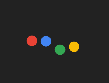
Several dots that grow/shrink, or move indicating activity.
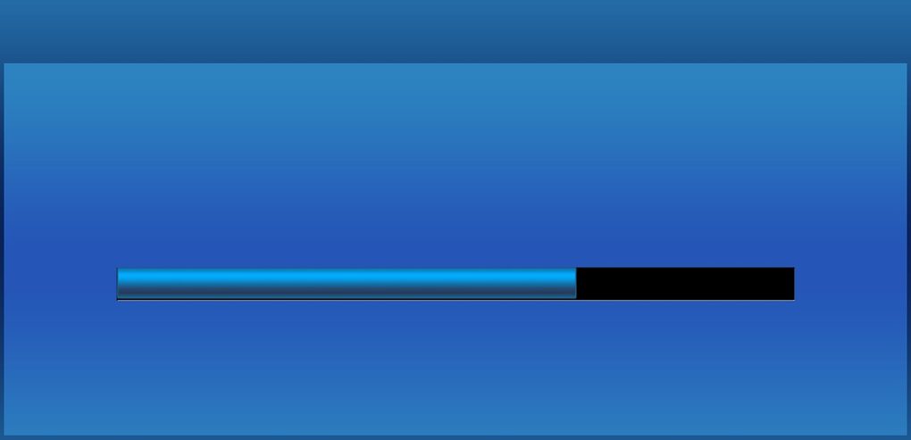
Bars
Fill-up or moving loading bars that show progress.
2. Multi-Element Loader
3D Boxes

Boxes rotating or flipping in 3D space
Roller coaster loaders

Elements moving on a path, resembling a roller coaster.
Custom animation
Self-developed loaders according to the theme or brand of the website.
Loading animation Case Studies of Popular Websites:
Google: Easy and minimalistic loaders that are just blended in their clean design.
Facebook: Branded custom animations reflecting their signature blue color scheme and style.
Airbnb: Stylish, engaging animation loaders adding to the UX in their totality.
Incorporating Loading Animations into Web projects
Loading animations implemented in web projects can definitely improve user experience. This is particularly true for dynamic applications where load times vary. Here is how to add loaders efficiently to your projects:
Best Practices for Adding Loaders
Simple and Lightweight Animations: The animation itself shouldn’t add much to the load time.
CSS vs. JavaScript: Prefer CSS over JavaScript; it’s definitely high performance and less resource-intensive.
Display loaders only when necessary: The loaders must not show when the load time is very short. Otherwise, they would be a bigger hassle than they’re worth.
Loader in Frameworks
Now, loaders are comparatively easy to include in frameworks such as React and Next.js. For illustration, the following is a spinner inside a React component:
```javascript

import React, { useState, useEffect } from 'react';

const LoadingSpinner = () => (

  <div className="spinner"></div>

);

const DataFetchingComponent = () =>

const [loading, setLoading] = useState(true);

  const [data, setData] = useState(null);

  useEffect(() => {

    fetch('/api/data')

      .then(response => response.json())

      .then(data => {

        setData(data);

        setLoading(false);

      });

  }, []);

  if(loading) {

return <LoadingSpinner />;

  }

  return (

    <div>

      <h1>Data Loaded</h1>

      {/* Render your data here */}

    </div>

  );

};

export default DataFetchingComponent;

``
This example shows how the loader will make the user experience smooth while fetching data.
Performance Considerations
Loading animations should be optimized to ensure that, in the worst case, they do not actually harm performance. Here are the key considerations:
Optimize CSS animations: Properties accelerated by the GPU—like `transform` and `opacity”—end up providing smoother animations.
Minimize JavaScript use: Prefer doing animations in CSS to minimize the computational load of your script.
Asynchronous loading of animations: Be sure that your loading animations are loaded asynchronously to keep from blocking the main content on a page.
Lazy load animations: Make sure to only load the animation when it’s needed, which will reduce the initial load time.
CSS variables: This abstraction of values is going to be very beneficial in controlling and making the animation more maintainable.
Example:
```css

:root {

  --spinner-size: 40px;

  --spinner-color: #09f;

}

.spinner {

  width: var(--spinner-size);

  height: var(--spinner-size);

  border: 5px solid rgba(0, 0, 0, 0.1);

  border-left-color: var(--spinner-color);

  border-radius: 50%;

  animation: spin 1s linear infinite;

}

@keyframes spin {

  to { transform: rotate(360deg); }

}
Custom Loading Animations
A loading animation that caters to the website’s theme can be made in order to personalize the feature and help improve user engagement.
1. Changing Color, Size, and Other Properties
Any loader’s properties can easily be changed through CSS. For example, to change the size and color of a spinner, one would simply change the CSS properties.
Example:
```css

.spinner {

  width: 50px; /* Change size */

  height: 50px;

  border-left-color: #f09; /* Change color */

}

```
2. Adding Personalized Animations:
You can make an animation interesting by adding some personalized touches; this can be anything from using SVG animations to custom keyframes. Options include using SVGA animations for custom keyframes.
Example of a bouncing ball loader:
```html

<style>

  .bouncing-ball {

    width: 50px;

    height: 50px;

    background-color: #09f;

    border-radius: 50%;

    animation: bounce 1s infinite alternate;

  }

  @keyframes bounce {

from { transform: translateY(0); }

    to { transform: translateY(-50px); }

  }

</style>

<div class="bouncing-ball"></div>

```
Tools and Resources
Online Tools for Generating CSS Animations:
Animista: Generates CSS animations with changeable parameters.
Keyframes.app: The online editor to create and preview CSS keyframe animation.
Libraries and Plugins to Use for Loading Animations
Lottie: JSON can be used to render animations made in Adobe After Effects.
SpinKit: A collection of loading spinners, all made using CSS.
Useful Tutorials and Code Examples Links
MDN web docs: Extensive tutorials regarding CSS Animatios
CSS-Tricks: Multiplicity of articles and guides on the creation and customization of CSS loaders
Bottom line
Loading animations form an integral part in enhancing user experience since they engage users with visual cues during load times. Starting from the simplest spinners to the most sophisticated animations, they entertain and inform the users.
Follow best practices and use the right tools, and you will be including efficient and attractive loaders in your web projects, ensuring a seamless and pleasing experience for the users. You can play with different styles, customize them to your brand, and focus on performance to provide the best experience for your users.